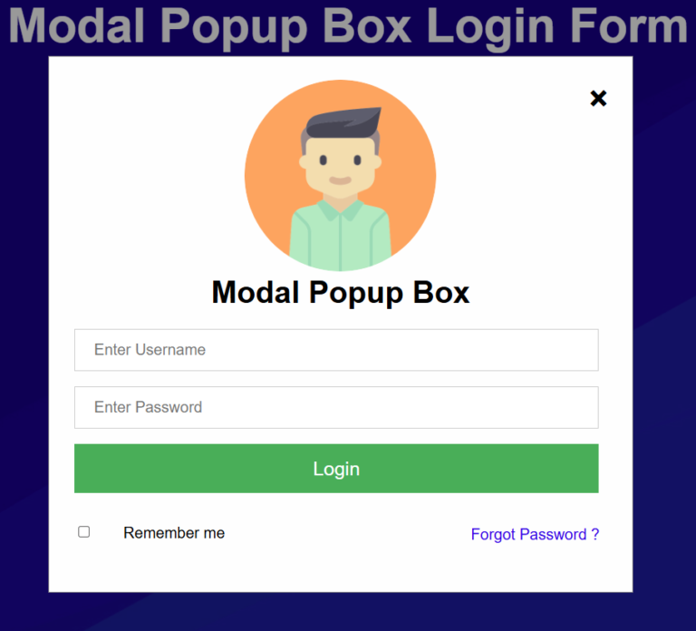
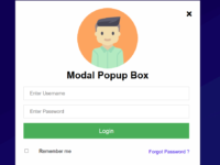
Modal Popup Login Form: 7 Easy Steps to Create a Powerful Popup Using HTML, CSS, and JavaScript
A Modal Popup Login Form is one of the most effective ways to improve user experience on modern websites. Instead of redirecting visitors to a separate login page, a modal popup allows users to sign in instantly without leaving the current page. This approach helps reduce friction, keeps users engaged, and creates a more professional appearance.
In this tutorial, you’ll learn how to create a Modal Popup Login Form using pure HTML, CSS, and JavaScript. The design is lightweight, responsive, and does not require any external libraries or frameworks.
Table of Contents
- What is a Modal Popup Login Form?
- Features of This Modal Popup Login Form
- Complete Source Code
- How the Code Works
- Benefits of Using a Modal Popup Login Form
- Useful Resources
- Final Thoughts
What is a Modal Popup Login Form?
A Modal Popup Login Form is a login window that appears on top of the current webpage. Users can enter their username and password without navigating away from the page they are currently viewing.
This type of login form is commonly used in eCommerce stores, blogs, web applications, and membership websites because it provides a smooth and user-friendly experience.
Features of This Modal Popup Login Form
This project includes the following features:
- Clean and modern popup login box
- Responsive design for desktop and mobile devices
- Smooth zoom-in animation effect
- Click outside the popup to close it
- Close button for easy dismissal
- No external libraries required
- Beginner-friendly source code
Complete Source Code
<!DOCTYPE html>
<html>
<title>Modal Popup Box</title>
<style>
*{margin:0px; padding:0px; font-family:Helvetica, Arial, sans-serif;}
/* Full-width input fields */
input[type=text], input[type=password] {
width: 90%;
padding: 12px 20px;
margin: 8px 26px;
display: inline-block;
border: 1px solid #ccc;
box-sizing: border-box;
font-size:16px;
}
/* Set a style for all buttons */
button {
background-color: #4CAF50;
color: white;
padding: 14px 20px;
margin: 8px 26px;
border: none;
cursor: pointer;
width: 90%;
font-size:20px;
}
button:hover {
opacity: 0.8;
}
/* Center the image and position the close button */
.imgcontainer {
text-align: center;
margin: 24px 0 12px 0;
position: relative;
}
.avatar {
width: 200px;
height:200px;
border-radius: 50%;
}
/* The Modal (background) */
.modal {
display:none;
position: fixed;
z-index: 1;
left: 0;
top: 0;
width: 100%;
height: 100%;
overflow: auto;
background-color: rgba(0,0,0,0.4);
}
/* Modal Content Box */
.modal-content {
background-color: #fefefe;
margin: 4% auto 15% auto;
border: 1px solid #888;
width: 40%;
padding-bottom: 30px;
}
/* The Close Button (x) */
.close {
position: absolute;
right: 25px;
top: 0;
color: #000;
font-size: 35px;
font-weight: bold;
}
.close:hover,.close:focus {
color: red;
cursor: pointer;
}
/* Add Zoom Animation */
.animate {
animation: zoom 0.6s
}
@keyframes zoom {
from {transform: scale(0)}
to {transform: scale(1)}
}
</style>
</style>
<body background="background.jpg">
<h1 style="text-align:center; font-size:50px; color:#fff">Modal Popup Box Login Form</h1>
<button onclick="document.getElementById('modal-wrapper').style.display='block'" style="width:200px; margin-top:200px; margin-left:160px;">Open Popup</button>
<div id="modal-wrapper" class="modal">
<form class="modal-content animate" action="/action_page.php">
<div class="imgcontainer">
<span onclick="document.getElementById('modal-wrapper').style.display='none'" class="close" title="Close PopUp">×</span>
<img src="1.png" alt="Avatar" class="avatar">
<h1 style="text-align:center">Modal Popup Box</h1>
</div>
<div class="container">
<input type="text" placeholder="Enter Username" name="uname">
<input type="password" placeholder="Enter Password" name="psw">
<button type="submit">Login</button>
<input type="checkbox" style="margin:26px 30px;"> Remember me
<a href="#" style="text-decoration:none; float:right; margin-right:34px; margin-top:26px;">Forgot Password ?</a>
</div>
</form>
</div>
<script>
// If user clicks anywhere outside of the modal, Modal will close
var modal = document.getElementById('modal-wrapper');
window.onclick = function(event) {
if (event.target == modal) {
modal.style.display = "none";
}
}
</script>
</body>
</html>
How the Code Works
HTML Structure
The HTML creates the popup trigger button, modal container, login form, user input fields, checkbox, and action buttons.
CSS Styling
The CSS controls:
- Modal positioning
- Input field appearance
- Button styling
- Responsive layout
- Hover effects
- Zoom animation
JavaScript Functionality
JavaScript provides the interactive behavior by:
- Opening the modal popup
- Closing the popup using the close icon
- Closing the popup when users click outside the login form
Benefits of Using a Modal Popup Login Form
A Modal Popup Login Form offers several advantages:
- Improves user experience
- Reduces page reloads
- Increases user engagement
- Creates a modern website interface
- Keeps visitors focused on the current page
- Works well on desktop and mobile devices
Useful Resources
For additional web development learning, visit:
- W3C HTML Standards: https://www.w3.org/
- MDN Web Docs: https://developer.mozilla.org/
- CSS Reference: https://developer.mozilla.org/en-US/docs/Web/CSS
You may also find these tutorials helpful:
- HTML Forms Tutorial
- CSS Animation Guide
- JavaScript Event Handling Basics
Final Thoughts
Creating a Modal Popup Login Form with HTML, CSS, and JavaScript is an excellent beginner project that teaches important front-end development concepts. By combining structured HTML, attractive CSS styling, and simple JavaScript interactions, you can build a professional login experience without relying on external frameworks.
Whether you’re developing a portfolio website, business portal, membership platform, or web application, a Modal Popup Login Form can significantly enhance usability while maintaining a clean and modern design.