











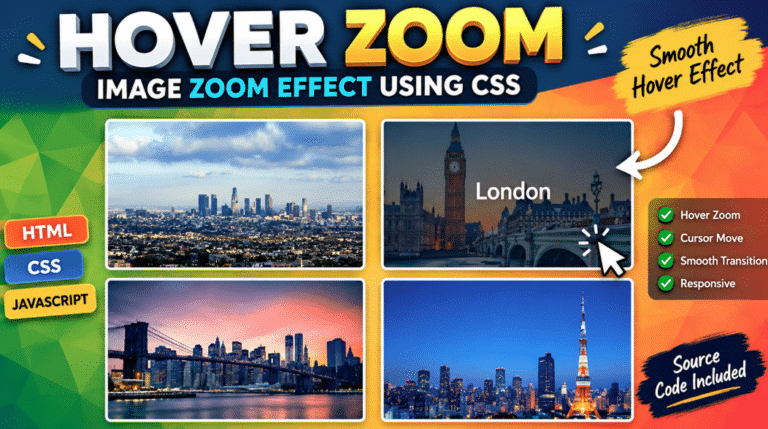
Mouse Hover Zoom Effect Using CSS with a smooth hover transition, hover image CSS, cursor movement and responsive image animation. Learn with simple code.
Mouse Hover Zoom Effect Using CSS is a simple and attractive way to make images more interactive on a website. When a visitor moves the cursor over an image, the image smoothly zooms in and moves according to the cursor position.
This effect can be used on portfolio websites, product cards, image galleries, blog thumbnails, photography websites and landing pages.
The best part is that the basic effect uses only HTML, CSS and a small amount of JavaScript. You don’t need a large library or complicated framework.
The transform property is used to scale and move the image, while transition creates the smooth animation. You can learn more about CSS transforms from the official MDN CSS transform documentation.
Why Use This Hover Image CSS Effect?
A static image can look ordinary. Adding a small interaction makes the design feel more modern without making the page complicated.
This effect provides:
- Smooth image zoom
- Cursor-based image movement
- CSS hover transition
- Responsive layout
- Lightweight implementation
- No external library
- Easy customization
You can change the zoom level, animation speed, image size, border radius and background according to your website design.
Mouse Hover Zoom Effect Using CSS Demo
The following example creates a responsive image box. When the cursor enters the image, JavaScript calculates its position and moves the image slightly toward the cursor.
The CSS controls the appearance and transition, while JavaScript handles the cursor movement.
Complete Source Code
Save the files using the structure below:
mouse-hover-zoom/
│
├── index.html
├── style.css
└── script.js
Use the following code:
<!-- =====================================================
     index.html
     ===================================================== -->

<!DOCTYPE html>
<html lang="en">
<head>

    <meta charset="UTF-8">

    <meta name="viewport"
          content="width=device-width, initial-scale=1.0">

    <title>Mouse Hover Zoom Effect Using CSS</title>

    <link rel="stylesheet" href="style.css">

</head>

<body>

    <div class="zoom-container" id="zoomContainer">

        <img
            src="1.jpg"
            alt="Mouse Hover Zoom Effect Using CSS"
            id="zoomImage"
        >

    </div>

    <script src="script.js"></script>

</body>
</html>


/* =====================================================
   style.css
   ===================================================== */

* {
    margin: 0;
    padding: 0;
    box-sizing: border-box;
}

body {
    min-height: 100vh;
    display: flex;
    justify-content: center;
    align-items: center;
    background: #f1f5f9;
    font-family: Arial, sans-serif;
}

.zoom-container {
    width: 500px;
    height: 330px;
    overflow: hidden;
    position: relative;
    border-radius: 20px;
    cursor: crosshair;
    box-shadow: 0 20px 45px rgba(0, 0, 0, 0.18);
}

.zoom-container img {
    width: 100%;
    height: 100%;
    display: block;
    object-fit: cover;
    transform: scale(1);
    transition: transform 0.35s ease-out;
}

.zoom-container:hover img {
    transform: scale(1.25);
}

@media (max-width: 600px) {

    .zoom-container {
        width: 90%;
        height: 260px;
    }

}


/* =====================================================
   script.js
   ===================================================== */

const container = document.getElementById("zoomContainer");
const image = document.getElementById("zoomImage");

container.addEventListener("mousemove", function(event) {

    const rect = container.getBoundingClientRect();

    const x = event.clientX - rect.left;
    const y = event.clientY - rect.top;

    const moveX = ((x / rect.width) - 0.5) * 20;
    const moveY = ((y / rect.height) - 0.5) * 20;

    image.style.transform =
        `scale(1.25) translate(${moveX}px, ${moveY}px)`;

});

container.addEventListener("mouseleave", function() {

    image.style.transform = "scale(1)";

});


/* =====================================================
   COPY CODE BUTTON
   Add this JavaScript if your blog code blocks
   use .code-content and .copy-button
   ===================================================== */

document.querySelectorAll(".copy-button").forEach(function(button) {

    button.addEventListener("click", function() {

        const code = button
            .parentElement
            .querySelector(".code-content")
            .innerText;

        navigator.clipboard.writeText(code).then(function() {

            button.innerText = "Copied!";

            setTimeout(function() {
                button.innerText = "Copy Code";
            }, 1500);

        });

    });

});
How the Cursor Move Effect Works
The image starts at its normal size. When the cursor enters the image area, the CSS applies a larger scale.
The JavaScript then detects the cursor’s horizontal and vertical position. Depending on where the cursor is located, the image moves slightly in the opposite direction.
This produces a natural zoom interaction instead of simply enlarging the entire image.
You can change:
transform: scale(1.25);
to:
transform: scale(1.10);
for a softer effect, or increase it for a stronger zoom.
The transition speed can also be changed:
transition: transform 0.35s ease-out;
For a faster effect, try 0.2s. For a slower animation, try 0.6s.
Where Can You Use This Effect?
This Mouse Hover Zoom Effect Using CSS works particularly well for product images, portfolio projects, blog thumbnails, photography galleries and creative landing pages.
For product websites, the visitor can move the cursor over an image to see more detail.
For portfolio websites, the same interaction can make project thumbnails more engaging.
For blog websites, a small zoom can make featured images feel more dynamic while keeping the overall layout simple.
Responsive Design
The example also includes a mobile-friendly media query.
On smaller screens, the image container automatically becomes narrower. Since touch devices don’t have a traditional mouse cursor, the hover interaction is mainly useful on desktop devices.
For better accessibility, you can also respect users who prefer reduced motion. MDN provides additional information about CSS transforms and motion-related accessibility considerations in its CSS documentation.
🎬 Watch the Complete Tutorial
Follow the video tutorial to understand how the PHP shopping cart works from product listing to cart management.
Useful Resources
For learning more about the properties used in this project, readers can visit the official MDN CSS Transform documentation and MDN CSS Transition documentation.
Final Words
The Mouse Hover Zoom Effect Using CSS is a small project, but it is a great example of how HTML, CSS and JavaScript can work together to create a modern website interaction.
With just an image container, CSS transition and a few lines of JavaScript, you can create a smooth hover image CSS effect with cursor movement.
Try changing the scale, transition speed and container dimensions to match your website design. This same technique can also be adapted for product cards, galleries and portfolio sections.
