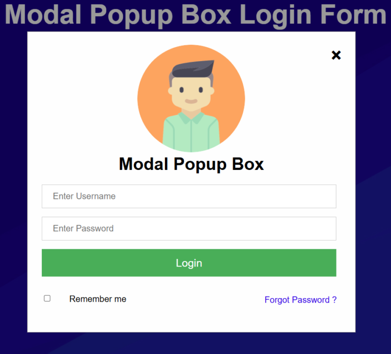
How to Create a Modal Popup Login Form Using HTML, CSS, and JavaScript
A modal popup login form is a popular UI element used on modern websites to allow users to log in without leaving the current page. In this tutorial, you’ll learn how to create a responsive popup login form using pure HTML, CSS, and JavaScript.
Features
- Clean popup login box
- Smooth zoom animation
- Click outside to close popup
- Responsive design
- No external libraries required
Complete Source Code
<!DOCTYPE html>
<html>
<title>Modal Popup Box</title>
<style>
*{margin:0px; padding:0px; font-family:Helvetica, Arial, sans-serif;}
/* Full-width input fields */
input[type=text], input[type=password] {
width: 90%;
padding: 12px 20px;
margin: 8px 26px;
display: inline-block;
border: 1px solid #ccc;
box-sizing: border-box;
font-size:16px;
}
/* Set a style for all buttons */
button {
background-color: #4CAF50;
color: white;
padding: 14px 20px;
margin: 8px 26px;
border: none;
cursor: pointer;
width: 90%;
font-size:20px;
}
button:hover {
opacity: 0.8;
}
/* Center the image and position the close button */
.imgcontainer {
text-align: center;
margin: 24px 0 12px 0;
position: relative;
}
.avatar {
width: 200px;
height:200px;
border-radius: 50%;
}
/* The Modal (background) */
.modal {
display:none;
position: fixed;
z-index: 1;
left: 0;
top: 0;
width: 100%;
height: 100%;
overflow: auto;
background-color: rgba(0,0,0,0.4);
}
/* Modal Content Box */
.modal-content {
background-color: #fefefe;
margin: 4% auto 15% auto;
border: 1px solid #888;
width: 40%;
padding-bottom: 30px;
}
/* The Close Button (x) */
.close {
position: absolute;
right: 25px;
top: 0;
color: #000;
font-size: 35px;
font-weight: bold;
}
.close:hover,.close:focus {
color: red;
cursor: pointer;
}
/* Add Zoom Animation */
.animate {
animation: zoom 0.6s
}
@keyframes zoom {
from {transform: scale(0)}
to {transform: scale(1)}
}
</style>
</style>
<body background=”background.jpg”>
<h1 style=”text-align:center; font-size:50px; color:#fff”>Modal Popup Box Login Form</h1>
<button onclick=”document.getElementById(‘modal-wrapper’).style.display=’block'” style=”width:200px; margin-top:200px; margin-left:160px;”>
Open Popup</button>
<div id=”modal-wrapper” class=”modal”>
<form class=”modal-content animate” action=”/action_page.php”>
<div class=”imgcontainer”>
<span onclick=”document.getElementById(‘modal-wrapper’).style.display=’none'” class=”close” title=”Close PopUp”>×</span>
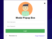
<img src=”1.png” alt=”Avatar” class=”avatar”>
<h1 style=”text-align:center”>Modal Popup Box</h1>
</div>
<div class=”container”>
<input type=”text” placeholder=”Enter Username” name=”uname”>
<input type=”password” placeholder=”Enter Password” name=”psw”>
<button type=”submit”>Login</button>
<input type=”checkbox” style=”margin:26px 30px;”> Remember me
<a href=”#” style=”text-decoration:none; float:right; margin-right:34px; margin-top:26px;”>Forgot Password ?</a>
</div>
</form>
</div>
<script>
// If user clicks anywhere outside of the modal, Modal will close
var modal = document.getElementById(‘modal-wrapper’);
window.onclick = function(event) {
if (event.target == modal) {
modal.style.display = “none”;
}
}
</script>
</body>
</html>
How It Works
HTML Structure
The HTML creates the popup button, modal container, login form, input fields, and action buttons.
CSS Styling
The CSS handles:
- Popup positioning
- Form styling
- Responsive layout
- Zoom-in animation
- Hover effects
JavaScript Functionality
JavaScript is used to:
- Open the popup when the button is clicked
- Close the popup when the close icon is clicked
- Close the popup when the user clicks outside the modal
Final Thoughts
Modal popup login forms improve user experience by allowing visitors to sign in without navigating to a separate page. This lightweight solution uses only HTML, CSS, and JavaScript, making it perfect for beginners and professional web developers alike.